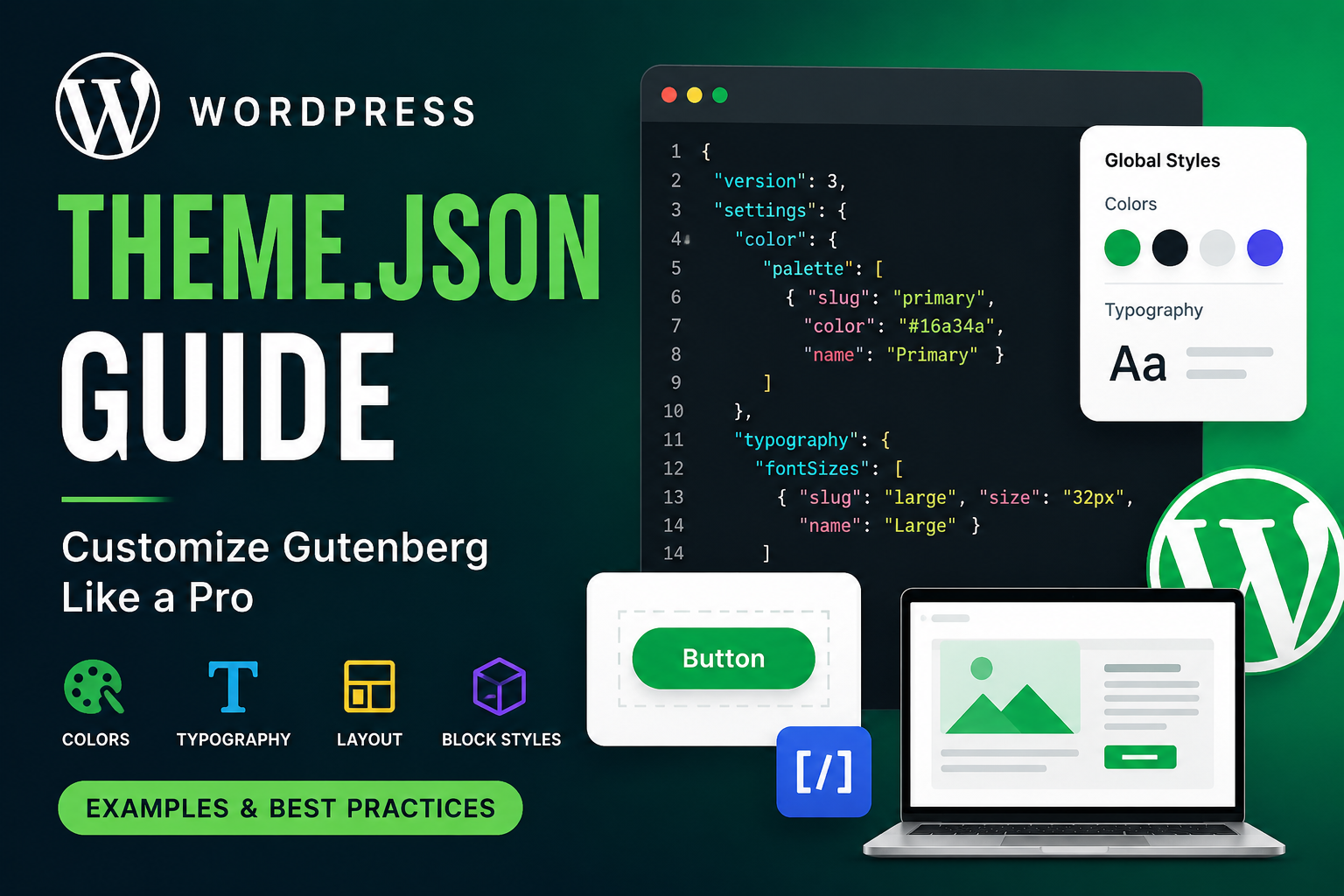
WordPress introduced theme.json to make block themes and Gutenberg customization much easier. Instead of writing large amounts of CSS, PHP, and custom settings, you can now control typography, colors, spacing, layouts, and block styles from a single JSON file.
If you are building modern WordPress themes, learning theme.json is essential.
What is theme.json?
theme.json is a configuration file introduced in WordPress Full Site Editing (FSE).
It allows developers to:
- Control global styles
- Configure Gutenberg editor settings
- Define typography
- Set spacing presets
- Manage color palettes
- Configure layouts
- Customize individual blocks
- Reduce custom CSS
Location:
/wp-content/themes/your-theme/theme.jsonWhy theme.json is Important
Before theme.json, developers usually managed settings using:
functions.php- Custom CSS
- Editor styles
- Theme support functions
- Block editor hooks
Now everything can be centralized.
Benefits of theme.json
✅ Cleaner theme structure
✅ Better Gutenberg integration
✅ Less CSS code
✅ Easier maintenance
✅ Consistent design system
✅ Better editor experience
✅ Faster development
Basic theme.json Structure
{
  "version": 3,
  "settings": {},
  "styles": {},
  "templates": {},
  "customTemplates": {}
}
Understanding Main Sections
| Section | Purpose |
|---|---|
settings | Configure editor settings |
styles | Apply global styles |
templates | Register templates |
customTemplates | Add custom templates |
Simple theme.json Example
{
  "version": 3,
  "settings": {
    "color": {
      "palette": [
        {
          "slug": "primary",
          "color": "#16a34a",
          "name": "Primary Green"
        },
        {
          "slug": "secondary",
          "color": "#0f172a",
          "name": "Dark"
        }
      ]
    }
  },
  "styles": {
    "color": {
      "background": "#ffffff",
      "text": "#111827"
    }
  }
}
Folder Structure Example
my-theme/
│
├── style.css
├── functions.php
├── theme.json
├── templates/
├── parts/
└── assets/
Adding Custom Color Palette
This creates reusable Gutenberg colors.
Example
{
  "settings": {
    "color": {
      "palette": [
        {
          "slug": "primary",
          "name": "Primary",
          "color": "#22c55e"
        },
        {
          "slug": "danger",
          "name": "Danger",
          "color": "#ef4444"
        }
      ]
    }
  }
}
Result
Inside Gutenberg editor:
- Users can select custom colors
- Colors become design-system based
- Consistent UI across website
Typography Settings
You can define:
- Font sizes
- Font families
- Line height
- Font weights
Example
{
  "settings": {
    "typography": {
      "fontSizes": [
        {
          "slug": "small",
          "size": "14px",
          "name": "Small"
        },
        {
          "slug": "medium",
          "size": "18px",
          "name": "Medium"
        },
        {
          "slug": "large",
          "size": "32px",
          "name": "Large"
        }
      ]
    }
  }
}
Global Font Family Example
{
  "styles": {
    "typography": {
      "fontFamily": "Inter, sans-serif"
    }
  }
}
Layout Configuration
You can define content width globally.
Example
{
  "settings": {
    "layout": {
      "contentSize": "850px",
      "wideSize": "1200px"
    }
  }
}
Spacing Controls
Manage padding and margin presets.
Example
{
  "settings": {
    "spacing": {
      "spacingSizes": [
        {
          "slug": "small",
          "size": "10px",
          "name": "Small"
        },
        {
          "slug": "medium",
          "size": "30px",
          "name": "Medium"
        }
      ]
    }
  }
}
Styling Entire Website
You can style body globally.
Example
{
  "styles": {
    "spacing": {
      "padding": {
        "top": "20px",
        "bottom": "20px"
      }
    },
    "typography": {
      "lineHeight": "1.7"
    }
  }
}
Block-Level Styling
One of the best features.
You can style specific Gutenberg blocks.
Button Block Example
{
  "styles": {
    "blocks": {
      "core/button": {
        "border": {
          "radius": "12px"
        },
        "color": {
          "background": "#16a34a",
          "text": "#ffffff"
        },
        "spacing": {
          "padding": {
            "top": "12px",
            "bottom": "12px",
            "left": "24px",
            "right": "24px"
          }
        }
      }
    }
  }
}
Image Block Example
{
  "styles": {
    "blocks": {
      "core/image": {
        "border": {
          "radius": "20px"
        }
      }
    }
  }
}
Disable Custom Colors
Useful for client projects.
Example
{
  "settings": {
    "color": {
      "custom": false
    }
  }
}
Disable Custom Font Sizes
{
  "settings": {
    "typography": {
      "customFontSize": false
    }
  }
}
Add Gradient Support
{
  "settings": {
    "color": {
      "gradients": [
        {
          "slug": "green-gradient",
          "gradient": "linear-gradient(135deg,#16a34a,#22c55e)",
          "name": "Green Gradient"
        }
      ]
    }
  }
}
Add Custom CSS Inside theme.json
WordPress now supports custom CSS.
Example
{
  "styles": {
    "css": "
      .wp-block-post-title{
        text-transform: uppercase;
      }
    "
  }
}
Real Production Example
Here is a practical wellness/eCommerce style setup.
{
  "version": 3,
  "settings": {
    "layout": {
      "contentSize": "850px",
      "wideSize": "1280px"
    },
    "color": {
      "palette": [
        {
          "slug": "primary",
          "name": "Primary",
          "color": "#16a34a"
        },
        {
          "slug": "secondary",
          "name": "Secondary",
          "color": "#0f172a"
        },
        {
          "slug": "light",
          "name": "Light",
          "color": "#f8fafc"
        }
      ]
    },
    "typography": {
      "fontSizes": [
        {
          "slug": "small",
          "size": "14px",
          "name": "Small"
        },
        {
          "slug": "medium",
          "size": "18px",
          "name": "Medium"
        },
        {
          "slug": "large",
          "size": "36px",
          "name": "Large"
        }
      ]
    }
  },
  "styles": {
    "color": {
      "background": "#ffffff",
      "text": "#111827"
    },
    "elements": {
      "heading": {
        "typography": {
          "fontWeight": "700"
        }
      }
    },
    "blocks": {
      "core/button": {
        "border": {
          "radius": "999px"
        },
        "color": {
          "background": "#16a34a",
          "text": "#ffffff"
        }
      }
    }
  }
}
Commonly Used Gutenberg Blocks
| Block | Name |
|---|---|
| Paragraph | core/paragraph |
| Heading | core/heading |
| Image | core/image |
| Button | core/button |
| Columns | core/columns |
| Group | core/group |
| Cover | core/cover |
Common Mistakes
1. Missing Version
Wrong:
{}Correct:
{
  "version": 3
}
2. Invalid JSON Format
JSON does NOT support trailing commas.
Wrong:
{
  "color": "#fff",
}
Correct:
{
  "color": "#fff"
}
Debugging Tips
- Validate JSON format
- Use browser console
- Check Gutenberg editor errors
- Clear cache
- Reload editor
theme.json vs Traditional CSS
| Feature | theme.json | CSS |
|---|---|---|
| Gutenberg Integration | ✅ | ❌ |
| Global Settings | ✅ | ❌ |
| Design System | ✅ | ❌ |
| Dynamic Presets | ✅ | ❌ |
| Advanced Animation | ❌ | ✅ |
Best Practices
✅ Keep design tokens consistent
✅ Use reusable palettes
✅ Limit custom colors
✅ Create typography scale
✅ Use block-level styles
✅ Avoid excessive inline CSS
When Should You Use theme.json?
Use it when:
- Building Gutenberg themes
- Creating block themes
- Building WooCommerce Gutenberg layouts
- Managing global styles
- Creating reusable design systems